By now most people, especially in the design industry noticed the new icon set from the Google Suite. Personally I understand why they take this direction. Creating a more uniform and modern design, in both design elements and in color. This helps with company branding and recognition. Yet the execution is far from perfect, let me explain.
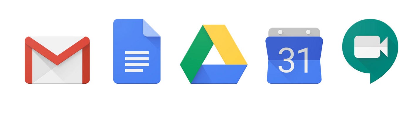
The Old Design
These are the icons everyone is familiar with, using mostly one base color per icon, with some shadow effect and different shapes per icon.
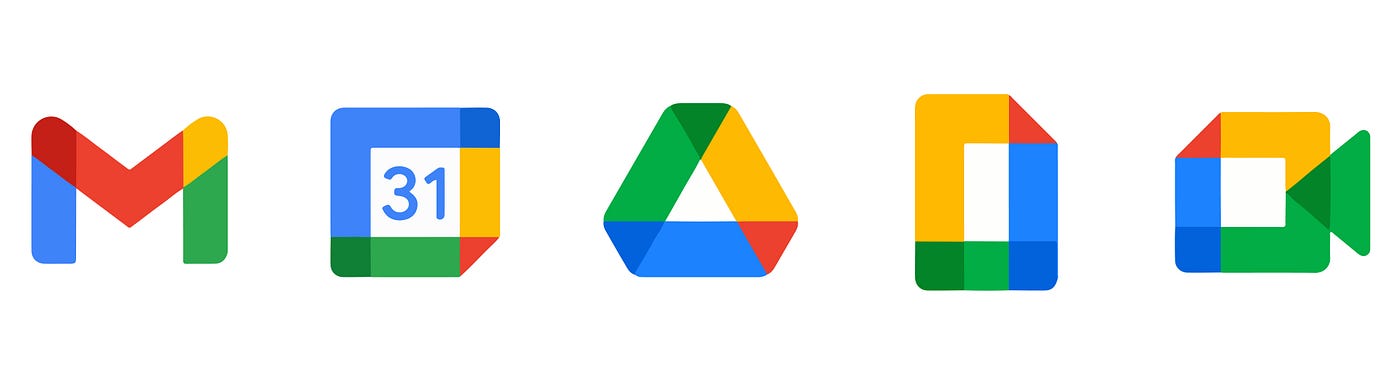
The New Design
In the new design they got rid of the shadows, differences in shapes and base color. Instead, they changed it to more uniform shape and the same colors across all icons.
The Problem
Maybe if you’re not so familiar with design, you could ask yourself; what is the big deal. Well… From a graphic standpoint it's a good move, to make in more uniform and related to the other Alphabet-Google products. However, this is not an icon you would see randomly placed at a website, while browsing the web. You will see this, when you are in a rush, needing to open your Gmail, Calendar, Drive, Docs or hangout. This changes the concept of the graphic design, to UX (User experience) design.
“This changes the concept of graphic design to UX design”
When it comes to UX design, you need to know that we make decisions in a fraction of a second. We decide where to click based on color, shape and size. This what exactly what Google decided to change and delete.
All icons look the same, have the same colors, and shapes. The user is now forced to think longer where he needs to click. Over time this can cause frustration because the user clicks on the wrong icon, has to go back, maybe clicks again on the wrong icon before arriving at the desired destination.
The Proposal and Solution
As I already stated, I support the idea of unifying the icons, that suits a better with Google Suits ;)
So to satisfy both parties, we need to: use a uniform design style, use one base color per icon and use shapes that is recognizable for the user to increase the User Experience. This is exactly what I did, and would love to share with you.

I’m a UI/UX Designer based in Istanbul, if you want to learn more about this project where I explain in more detail on all the icons from both Google and my design. You can check out my Behance website or visit My website.
Thank you for reading, if you found this interesting please give this 50 claps :)
